Measuring emotion: a look at reaction cards, BERT questionnaires, AttrakDiff and VisAWI
Over the past year or so, we've gotten very good at measuring usability and functionality in early signal tests. And, we're starting to follow those signals into the product. We want to predict how much a signal means in actual product change.
This is good. It's natural. The company's fork and cloud product redesign is following a normal design pattern.
Early design stages focused on functional aspects. Functionality ensures we deliver on a value proposition.
Next, we focused on usability. Usability makes the value proposition plain to users.
Functionality and usability don't stand alone in making an experience. We're interested in the emotional impacts of our designs. We want to evoke the right feels.
Understanding our target aesthetic helps us build a more human product. We want to build a product people love.
Aesthetics influence satisfaction. They affect:
- how likely a person is to buy a product (conversion)
- how likely they are to recommend a product (NPS)
- how likely they are to revisit a product (DAU)
So, how do we measure love? How do we measure aesthetics and attraction?
Turns out, there's a heap of established methods. We started experimenting with a few to see which can guide our design decisions.
Before you begin…
All these methods benefit from knowing the aesthetic qualities your team wants to achieve. Before you consider measuring aesthetics on your designs, run a workshop to define the desired qualities of your product.
Invite relevant stakeholder to your workshop. Get them bought into the qualities you want in your designs. It will make interpreting results easier.
Microsoft reaction cards
Reaction cards evaluate the emotional response of a design, prototype or product. The original set includes 118 words.
Method
The method is simple:
- After viewing a design, show respondents your set of cards.
- Ask them to pick a few (3–5) that describe the design.
- Then, ask them to describe why they chose each card.
When to use
Customer interviews, focus groups
When not to useLarge sample sizes or quantitative surveys
Pros
Smaller, qualitative groups allow for designers to hear the whys for given emotional reactions
Cons
- Doesn't provide a number for comparing between design iterations or competitors.
- Tons of cards
Analysis
Reaction cards are a qualitative approach. Designers must be present to direct respondents and pull out insights. Look for common themes from respondents to focus on in future design iterations.
Discussion
The method is easy to replicate using the desired qualities created by design teams. Don't feel limited to the official Microsoft set.
For example, we want our product to be bold. So, we could use a "bold" and "cautious" pair in our reaction card deck. In this way, we can reduce the amount of cards and tie them to our design goals.
Bipolar emotional response testing (BERT)
BERT is an overarching term for bipolar scale questionnaires. These questionnaires provide freedom to develop and test aesthetic qualities.
Method
- Develop they qualities you want to investigate in your designs.
- Using those qualities, create pairs of bipolar descriptors.
- Show images or prototypes to users.
- Then, ask users to chose where the design falls on a scale between selected bipolar descriptors.
For example, we want to make bold products. So, we develop a bipolar pair of words: cautious and bold. We show users a design and ask them to rate the design:
How would you describe the design? Cautious ( ) ( ) ( ) ( ) ( ) ( ) ( ) Bold
The "standard" BERT questionnaire (from our research) looks at 7 bi-polar qualities:
Intimidating – Friendly
Dated – Cutting edge
Poor quality – High quality
Antiquated – High tech
Unrefined – Sophisticated
Amateur – Professional
Ugly – Pretty
Assign the scale some values. Most use a simple likert scale from 1–7. The results give quantitative direction for design iterations.
When to use- Best when paired with qualitative customer interviews or focus groups.
- Testing how a design stacks up against competitors
Pros
- Flexibility. Track emotional responses to the team's desired aesthetic qualities, instead of an industry standard. This helps differentiate ourselves and promote a specific brand identity.
- Quick turnaround for quantitative insights
Cons
Without qualitative insights, BERT questionnaires may not help you learn what's pushing a design toward one side of a word pair or another.
Dos
- Randomize the order of questions
- Randomize which side of the question gets the negative or positive descriptor
Dont's
Don't forget to assign higher values to the desired quality in a word pair before interpreting results. Double check, especially if you randomized.
Analysis
The results can be analyzed per quality tested.
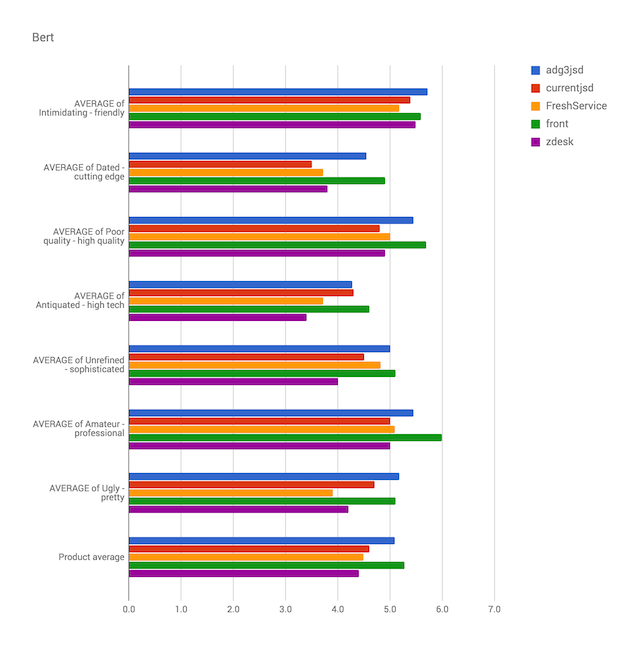
Compare the average values of each quality between designs. This can be useful to see where one succeeds and another needs improvement.
Theoretically, you could give an overall average score to designs. But, this seems less useful when trying to assess success.
AttrakDiff
AttrakDiff is a BERT questionnaire of 28 questions that measure hedonic stimulation and identity, pragmatic qualities, and attraction.
To boil it down, the framework looks into these 4 dimensions of a design. It asks 6 questions in each dimension to judge a design on whether it helps people:
Get shit done (pragmatic quality or PQ)
These questions ask users to describe their experience in terms of attributes associated with task completion. Design and aesthetics do not matter in getting a task done. These attributes ask about the pure mechanics of the software.
Technical – Human
Complicated – Simple
Impractical – Practical
Cumbersome – Straightforward
Confusing – Clearly structured
Unruly – Manageable
Align themselves with a product's identity (hedonic identification quality or HQI)
These questions ask users to describe their experience in terms of attributes associated with social rhetoric. These are attributes that they would use to describe to their friends, the voice in their head that niggles "what am I saying about myself by using this software?"
Unprofessional – Professional
Tacky – Stylish
Cheap – Premium
Alienating – Integrating
Separates me – Brings me closer
Unpresentable – Presentable
Progress to being a power user (hedonic stimulation quality or HQS)
These questions ask users to describe their experience in terms of attributes associate with personal growth and skill development. Does the software encourage them to do their best work and encourage them to be power users?
Conventional – Inventive
Unimaginative – Creative
Cautious – Bold
Conservative – Innovative
Dull – Captivating
Ordinary – Novel
Think the thing is beautiful (attractive quality or ATT)
These questions ask users to describe their experience in terms of attributes associate with the global appeal of their experience.
Unpleasant – Pleasant
Ugly – Attractive
Disagreeable – Likeable
Rejecting – Inviting
Bad – Good
Repelling – Appealing
Discouraging – Motivating
Method
Like other BERT questionnaires, the AttrakDiff survey asks people to rate an experience, prototype or design using opposing words . The framework assigns values from -3 (unwanted quality) to 3 (desired quality) for each word pair.
When to use
Best when paired with qualitative customer interviews or focus groups.
Pros
- Extremely well-researched and time-tested approach
- The resulting "grid view" makes at-a-glance comparisons between design iterations and competitors easy
Cons
Tests usability, not just aesthetics (see discussion)
Analysis
You can analyze AttrakDiff responses the same as any BERT questionnaire.
Additionally, AttrakDiff looks a the relationship between hedonic qualities and pragmatic qualities. If you plot these against each other, you can interpret your results in the following way:
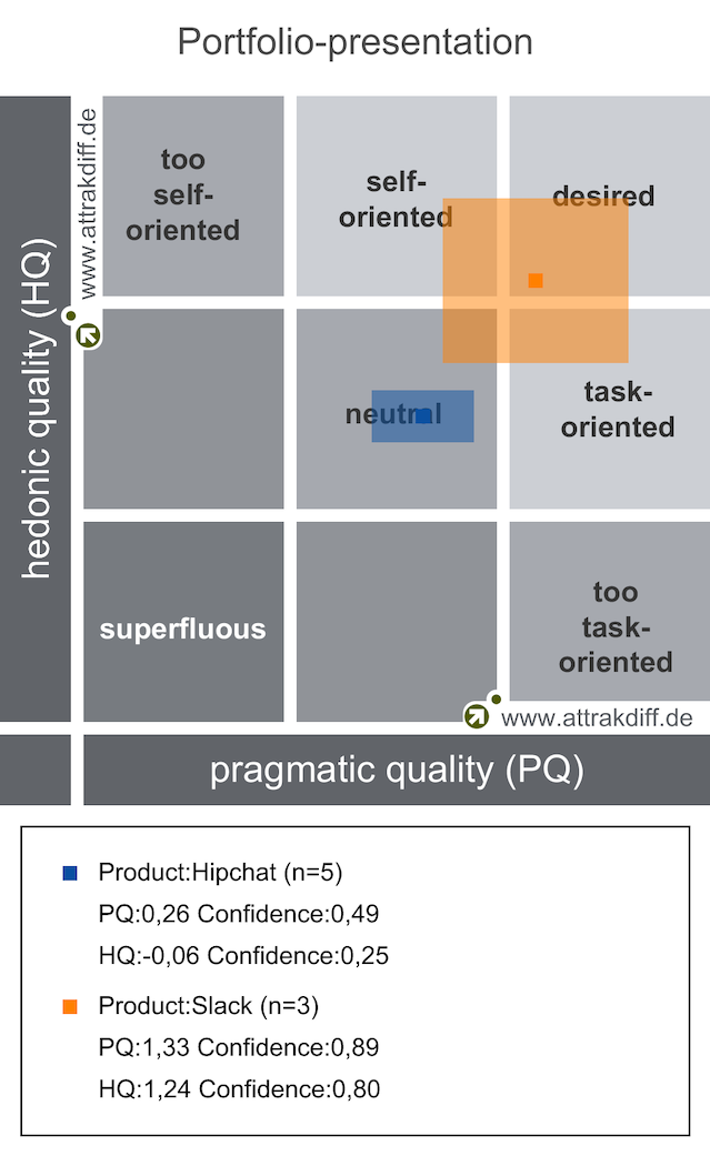
This "grid view" gives you some general direction. It is useful for comparing results from design variants or against competitors.
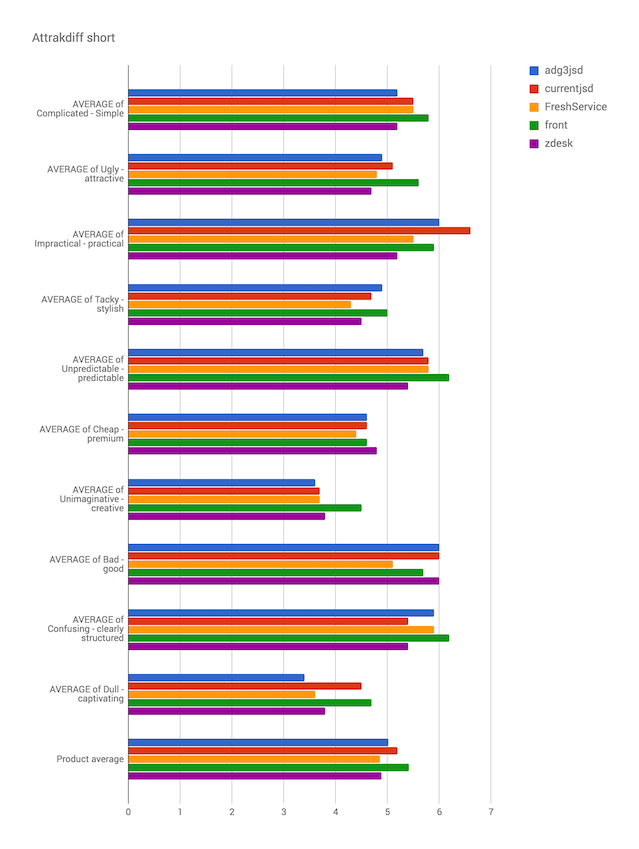
You can reduce the Attrakdiff questionnaire to a smaller survey. We recommend doing this for early signal tests.
The smaller test question set:
Complicated – Simple (PQ)
Ugly – Attractive (ATT)
Impractical – Practical (PQ)
Tacky – Stylish (HQI)
Unpredictable – Predictable
Cheap – Premium (HQI)
Unimaginative – Creative (HQS)
Bad – Good (ATT)
Confusing – Clearly structured (PQ)
Dull – Captivating (HQS)
Discussion
We already use "pragmatic" and usability test measures across the design team:
- Task completion
- Time on task
- Lostness
- UMUX-LITE
It may be unnecessary to go through the rigor of frameworks like AttrakDiff that try to balance usability with aesthetics.
If you are interested in the hedonic aspects provided by AttrakDiff, work these into your product's guiding qualities and use a more simple BERT questionnaire.
VisAWI
Visual aesthetics of website inventory (VisAWI) tests measure only the aesthetics of a design . They leave out pragmatic or "hedonic" qualities.
VisAWI tests measure first impressions and not usability. Use them on static images, not functioning prototypes.
The values returned from VisAWI evaluations correlate to AttrakDiff's attractiveness scale.
Method
- Show a user your design. Don't let them interact with it.
- Ask them to agree or disagree with a set of statements about the design. Value their responses from 1 "do not agree at all" to 7 "fully agree".
VisAWI looks at 4 facets of visual design: simplicity, diversity, colorfulness and craftsmanship.
Simplicity
The user interface appears too dense. (r)
The user interface is easy to grasp.
The user interface appears well structured.
The software appears patchy. (r)
Everything goes together on this software.
Diversity
The design is uninteresting. (r)
The user interface is inventive.
The design appears uninspired. (r)
The user interface appears dynamic.
The user interface is pleasantly varied.
Colorfulness
The color composition is attractive.
The choice of colors is botched. (r)
The colors do not match. (r)
The colors are appealing.
Craftsmanship
The user interface appears professionally designed.
The user interface is not up-to-date. (r)
The software is designed with care.
The design of the software lacks a concept. (r)
The questions marked with an (r) need their value to be subtracted from the the upper bound. For example, someone responded with a value of 3 for the statement "the layout appears too dense". Subtract this value from 8 to trend it positively.
When to use
Testing static images, logos, illustration styles, etc.
When not to use
Testing prototypes or other interactive experiences
Pros
- Relatively short evaluation survey
- Tests only aesthetics
Cons
The qualities tested may not provide insight into team-defined aesthetic goals.
Analysis
You can give the entire design an average score resulting from all questions. But, it's important to look at each facet group. Designs may lack in certain characteristics, like colorfulness or craftsmanship.
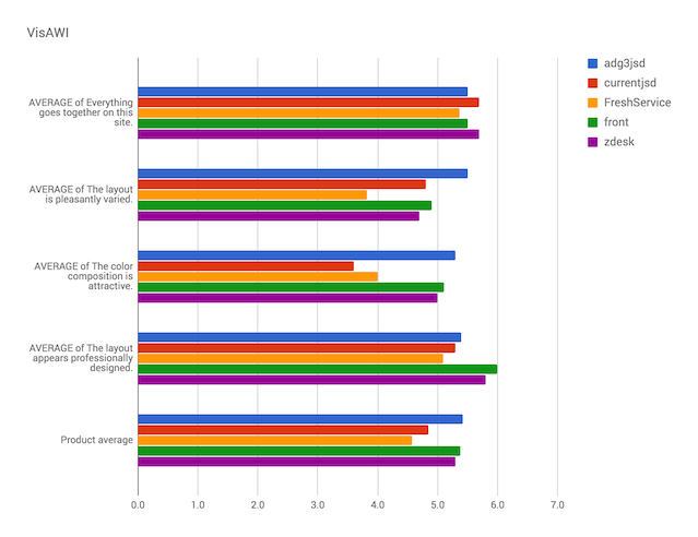
VisAWI-S is the short form of this test. It asks respondents to agree to only 4 statements, one for each facet of aesthetics:
Everything goes together on this software.
The user interface is pleasantly varied.
The color composition is attractive.
The user interface appears professionally designed.
Conclusion
Aesthetics are subjective. Qualitative testing will provide more meaningful and useful insights than quantifying through mass surveys.
Reaction cards may be the best of the above options for these insights. That said, BERT provides big numbers that can be used to sway data-driven stakeholders more easily.