2017 samples
Designing for emotion in voice and tone
"Delight" is a word that's the tech industry frequently throws around. Atlassian is no different. But, I seldom see any rationale behind what delight means, when to employ it, and how to measure it.
In 2017, a few Atlassian designers (myself included) took on the question of measuring emotion. We waded through existing industry methodologies hoping to find a means of measuring emotion that worked for us. Mainly, we wanted an approach that gave us quick, actionable signals. Read our overview of reaction cards, bi-polar emotional response testing (BERT), AttrakDiff, and VisAWI.
We agreed custom, lightweight BERT suited our needs best, because we could define the design qualities we wanted to attribute to our experience, test against those qualities, and get insights fast.

I took this idea further in our content guidelines. I gathered writers and designers together to test the emotions of our design system and the messaging we use to guide content designers.
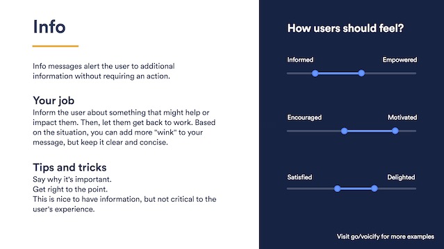
We developed a set of desired qualities for each of our products' interaction contexts, like when a user is successful, needs to be warned, and when something's gone wrong. And, we tested these qualities against variant messaging to provide our voice and tone guidelines validated examples for writing in any interface situation.
The result was a set of "voicify" cards that any writer, designer, or developer could pick up from their desk and guide them to appropriate messaging. They defined the emotional qualities we want our users to feel in a given situation, paired with our platform components. And, they ensured that we nailed the appropriate emotions for every interaction in our products. View the full voicify card set (pdf).
Solar clock
While I'm not much of a developer, I think it's important to get close to the development community. Learning some of the technology our front-enders use daily helps me speak their language and practices, and engage in deeper, more meaningful conversations with them. And, it helps me build their trust.

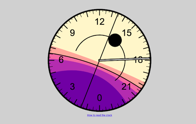
In 2017, I took time to build a tool to help me make better photos when I travel. I fell down a rabbit hole and ended up creating a 24-hour timepiece, drawn in HTML Canvas, and powered by javaScript. It takes your browser's geolocation and informs you of sunrise and sunset times, golden hour, and twilight.
I planned to package it up into an app for Android smartwatches, but I hit the limits of my development powers. Either way, this was a fun project to work on, spar with developer friends of mine, and get closer to the command line. It looks pretty, too.
Check out the solar clock in action, or clone a copy to see my messy code.
A procedure for terminology decisions
Atlassian is a massive organization, developing multiple self-hosted and cloud apps – anything from code review tools, to project management software, to modern wiki tools. They make a lot of things.
Towards the end of 2017, I was asked to spend some time with the company's design systems team. These folks create product-agnostic technologies that any Atlassian team can use to quickly create compelling, consistent, "Atlassian"-feeling software experiences.
The team asked me to help them research the impact of a terminology change, and whether the proposed alternatives made sense to customers. Since these terms appeared in tens of products and tens of thousands of communications, I took the request pretty seriously.
The project challenged me in many ways, and I ended up building a methodology that the company can use far into the future for similar decisions. Not only did I have to formalize my approaches to terminology and comprehension testing, I had to convince senior leaders to trust a new procedure that promised to save them headspace and deliver results.
Check out the resulting procedure (a bit censored to protect some sensitive corporate data).