Legislation

Documentation Specialist
Opera Software
Oslo, Norway
samueli@opera.com
Read the WCAG 2.0 recommendation in its entirety on W3C's site.

The EU Charter of Fundamental Rights "prohibits discrimination on grounds of disability" and "provides explicit recognition of the rights of persons with disabilities and the need to ensure their independence, social and occupational integration and participation in the life of the community."
Unfair or preferential treatment to one group or another based on abilities or perception is a human and civil rights issue.
Movements to improve disabled persons' access to public services, employment and education began to make headway in the 1970s, with the United States' passage of the Rehabilitation Act.
Global legislative bodies have revised these early documents to include telecommunications and web technologies.
The majority refer to WCAG 2.0 Level AA as the standard for preventing discrimination.
Your job as a technical writer is to write. But, you can help your developers meet the legal requirements for web accessibility by:
Provide text alternatives for any non-text content so that it can be changed into other forms people need, such as large print, braille, speech, symbols or simpler language.
Text is adaptable and translatable. Images are not. Rely on text to present information.
Review the following techniques for writing help:
All non-text information that is presented to the user must have a text alternative that serves the equivalent purpose.
Three situations need consideration when inserting non-text content:
In the case of a content management system (CMS), be ready to include alternative text when you upload non-text media to your repository.
Look for an "alt text" or "alternative image text" field. The CMS will add the appropriate attribute to the image element on the page.

Context is king. Alternative text must describe the content and function of images in the context of running text.
alt HTML attribute for providing textual alternatives to images. Valid HTML requires that all images include the alt attribute.alt attribute, but this can be left blank.alt attribute.<h3>Useful keyboard shortcuts</h3>
<p>Open a new tab:</p>
<img src="newTabShortcut.image" alt="Use Command + T to open a new tab."/>### Useful keyboard shortcuts
Open a new tab:
Open a new tab:

Use one alternative text description for groups of items.
<p>Our customers rated us: <img src="star.image" alt="4 out of 5 stars"/><img src="star.image" alt=""/><img src="star.image" alt=""/><img src="star.image" alt=""/><img src="greyStar.image" alt=""/>.</p>Our customers rated us: .Our customers rated us: 


 .
.
1. On a running page of text, an image of a mobile phone screen shows an engineering tool app. The phone is in the hand of a man on the job. Some text follows the image.
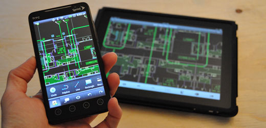
Engineers can use an Android smartphone app to configure equipment in the field…
What should appear in the image's alt attribute field?
2. On a running page of text, an image depicts an adaptor for interfacing between some equipment's terminal and a computer. There is no text in the image. Some text follows the image.

The interface adaptor
The company provides an adaptor for interfacing between the component and a Mac computer running the necessary application…
What should appear in the image's alt attribute field?
1. The text references the mobile app but does not provide a heading or other contextual indicator to help alternative user agents. The alt attribute should describe the content of the image.
alt="Engineering apps for Android"![Engineering apps for Android]2. The heading text describes the content of the illustration, effectively making the illustration supplementary. Therefore, no additional alternative text is needed.
alt=""![]If a short text alternative cannot describe the content (i.e. a chart or diagram), use a short text alternative that describes the image's content briefly and its purpose or function in the document. And, include a long text alternative that clarifies the details included in the image.
The hard way: provide a long description in a different location and link to it.
The easy way: Explain the content of the chart or diagram in your body copy. Use the alternative short text for the image that directs readers to the body copy.
<h2>2014 trends</h2>
<img src="monthlyUsers" alt="Unique monthly users chart for 2014, by product. Details in the following paragraph."/>
<figcaption>Figure 1. Unique monthly users, by product.</figcaption>
<p>All but one of our products showed growth in 2014 (see Figure 1). COLDCAM saw a significant increase of 125% during April, just after the launch of version 3. The app now has 1 million monthly users…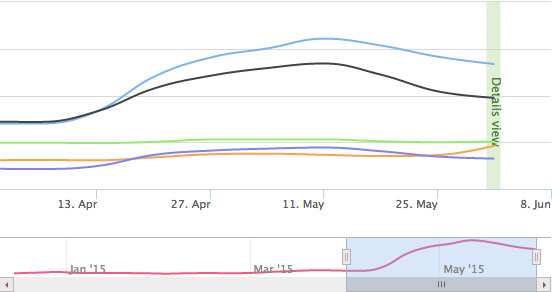
All but one of our products showed growth in 2014 (see Figure 1). COLDCAM saw a significant increase of 125% during April, just after the launch of version 3. The app now has 1 million monthly users…
3. In running text, an image depicts a table of values providing the appropriate distance between a piece of medical imaging equipment and a patient, based on procedure. The following text appears above the image:
Appropriate imaging distances
What should appear in the image's alt attribute field? How should the values be described textually?
4. In running text, an image depicts a workflow for how a requirement for manufacturing a component is approved by a committee of stakeholders. The image is captioned: "Figure 2. Requirements Approval Workflow". The workflow and diagram are known to change frequently. The following text appears beneath the image:
Requirements are approved by the working committee. The committee accepts proposed changes to requirements using the Requirements Approval Workflow (see Figure 2).
How can you provide a text alternative for the figure?
3. Figures, charts and tables should be fully explained in the running text of any good documentation. If they aren't explained in the text, they need not appear in the document. Alternative text for this table (presented as an image, instead of semantically rendered) should describe details about the content and inform the reader as to where the table's values are discussed in the text.
alt="A table of appropriate imaging distances between the telescope and the patient for procedures A, B, C and D. Details and distance values are discussed in the following paragraphs."![A table of appropriate imaging distances between the telescope and the patient for procedures A, B, C and D. Details and distance values are discussed in the following paragraphs.]4. The easy way:
Recast the document. Describe the workflow in the running copy of the text and revise this content when changes occur to the image. Use a short text alternative for the image that directs readers to the running text for relevant details.
If the non-text element takes user input, use one of the follow techniques:
For image maps (rare), use alt attribute to provide text descriptions of map labels.
<img src="welcome.gif" usemap="#map1" alt="Areas in the library. Select an area for more information on that area." />
<map id="map1" name="map1">
  <area shape="rect" coords="0,0,30,30" href="reference.html" alt="Reference books" />
  <area shape="rect" coords="34,34,100,100" href="media.html" alt="Audio visual lab" />
</map>
Or, even better, avoid making image maps.
For links, use language that describes the purpose of the link. Best practice: use calls to action, be specific.
If links include an associated image, combine them.
<a href="latestNews.page">
  <img src="newIcon.image" alt=""/>
  Get the latest news.
</a>[ Get the latest news.](latestNews.page)<a href="build.page">
<img src="downloadButton.image" alt=""/>
Download the latest free version.
</a>[ Download the latest free version.](build.page)5. An image depicts the words "submit a report" boldly written across a piece of paper lying on a desk. This image links to a form for submitting reports about a dysfunctional piece of equipment. The following text appears below:
Dysfunctional equipment should be reported immediately. The company reviews these reports regularly to provide higher quality tools.
What should appear in the image's alt attribute field?
6. A link reads: "Download the full manual". The link contains an image depicting an Adobe PDF document.
What should appear in the image's alt attribute field?
5. The text does not reference the link and the call to action (submit a report) appears only in the image. Alternative text must be provided to describe the content in the image and describe the function of the link.
alt="Click to report dysfunctional equipment."![Click to report dysfunctional equipment.]6. Although the text provides the context and the function of the link, the icon provides visual cues to the file type of the link. The alternative text should give user agents the same information.
alt="PDF file"![PDF file]Provide text alternatives for videos and audio, both live and pre-recorded. For online assistance, most likely you will only contend with pre-recorded media.
Your responsibility is to describe what's happening in videos or audio tracks, through closed captions or transcriptions.
Provide a transcript of the audio recording and link to it immediately following the element on the page.
<audio controls>
  <source src="howTo.mp3" type="audio/mpeg"/>
    Your browser does not support the audio element. <a href="howTow.mp3">Download an mp3 copy of this audio recording.</a>
</audio>
<p><a href="howToTranscript">Read the transcript of our how-to podcast.</a></p>Captions are provided for all prerecorded audio content in synchronized media.
For mixed-media presentation, most likely video with an accompanying audio track, show captions always, as viewers may not know how to enable or disable them.
Currently, this has to be done with JavaScript. Consult your developer to see what implementation works best for you.
Depending on how your developer implements the media, you may be asked to create either a SubRip Text (SRT) or Web Video Text Track (VTT) file.
With any implementation, your responsibility as the technical writer is to provide the transcript and timings for captions. Write out the script. Get a stop watch. Prefer one or two line captions.
Sample VTT file:
WEBVTT FILE

Bookmarks feature close-up
00:00:10,000 --> 00:00:12,500
Press the Bookmarks button to store your favorite pages.

Start page close-up
00:00:13,200 --> 00:00:16,900
And, you can drag your favorites right to the start screen.
Sample SRT file:
1
Bookmarks feature close-up
00:00:10,000 --> 00:00:12,500
Press the Bookmarks button to store your favorite pages.

2
Start page close-up
00:00:13,200 --> 00:00:16,900
And, you can drag your favorites right to the start screen.
An alternative for time-based media or audio description of the prerecorded video content is provided for synchronized media.
Your responsibility is to describe the dialog, sounds, settings, characters (their traits and actions), text and graphics, etc., of the images and audio presented in videos. Any visual or auditory elements in your videos must have an alternative text description.
For writing help, review:
Use an in-text link and short description of the content in your body copy. Provide a link to a long-form alternative description just after the video.
<p>For safety, secure yourself to the platform with a bowline knot (see the video below for instructions).<p>
<video controls id="tyingABolwineKnowHelp">
  <source src="tyingABowlineKnot.mp4" type="video/mp4">
  Your browser does not support the video element. <a href="tyingABowlineKnot.mp4">Download an mp4 copy of this video recording.</a>
</video>
<p><a href="tyingABowlineKnotDescription">Read the transcript of how to tie this knot.</a></p>
For safety, secure yourself to the platform with a bowline knot (see the video below for instructions).
In the long description, provide a link back to the location of the original media.
<p><span class="visual">A man stands holding a length of rope. He stands at a table in a workshop.</span></p>
<p><span class="speaker">Narrator</span> Grab both ends of the rope loosely, one end in each hand.</p>
<p><span class="audio">Wood being sawn.</span></p>
<p><span class="visual">An overhead view of the table and the man's hands.</span></p>
<p><span class="speaker">Narrator</span> Holding your left hand still, move your right hand over your left wrist.</p>
…
<p><span class="speaker">Narrator</span> If you've done this correctly, you should have a weight-bearing knot. Thanks for watching.</p>
<p><a href="safetyPage#tyingABowlineKnotHelp">Return to the platform safety page.</a></p>When should you employ multimedia in technical documentation?
Never. Multimedia is difficult to maintain and presents a myriad of accessibility challenges.
Create content that can be presented in different ways (for example simpler layout) without losing information or structure.
In a recent study of screen-reader user preferences conducted by WebAIM, 23% of respondents preferred text-only versions of pages. Read the full survey on the WebAIM site.
Prioritize text and the structure of content over display methods or visual cues.
Get a plain-text editor, like Notepad or Sublime Text, and use proper, semantic HTML markup.
When the sequence in which content is presented affects its meaning, a correct reading sequence can be programmatically determined.
Order content in a meaningful sequence:
Rely on your plain text version of the document. Then, mark up this text correctly and minimally.
Information, structure, and relationships conveyed through presentation can be programmatically determined or are available in text.
Separate information and structure from presentation and formatting:
Mark text with HTML to indicate structure. Use CSS to style and format the marked text.
Learn Markdown. There are many tools available to transform Markdown into standard HTML. You'll make less error, spot errors more easily, and structure/order your content more naturally.
Use h1 through h6 elements to indicate heading levels.
<h1>Heading level 1 (title)</h1>
<h2>Heading level 2 (chapter or main section heading)</h2>
<h3>Heading level 3 (subsection heading)</h3>
# Heading level 1 (title) ## Heading level 2 (chapter or main section heading) ### Heading level 3 (subsection heading)
A screen reader can recognize the code and announce the text as a heading with its level, beep or provide some other auditory indicator. Screen readers are also able to navigate heading markup which can be an effective way for screen reader users to more quickly find the content of interest.
Use em and strong elements to emphasize text. Screen readers may use a different inflection when reading phrases with exclamation points, em or strong elements.
i and b are considered stylistic differences and will not change the inflection of alternative user agents.
<p>The <em>text</em> in this <strong>paragraph</strong> has two different forms of emphasis: <em>emphasized</em> and <strong>strong</strong>.<p>The *text* in this **paragraph** has two different forms of emphasis: *emphasized* and **strong**.
If variants in the text face mean more than just emphasis, use text to explain why the text appears differently. Variants include style, color, typeface and treatment.
<h2>Web Accessibility Guidelines</h2>
  <ul>
    <li><strong>WCAG 2.0 (New)</strong></li>
    <li>WCAG 1.0</li>
    <li>Section 508</li>
    <li>JIS X 8341-3</li>
  </ul>
## Web Accessibility Guidelines
- **WCAG 2.0 (New)**
- WCAG 1.0
- Section 508
- JIS X 8341-3Use proper lists, including lists of links. Alternative readers can jump from list to list or item to item.
ol indicates ordered lists, useful for step-by-step descriptions.
<p>Here are some steps to follow:</p>
<ol>
  <li>First, do this.</li>
  <li>Then, do something else.</li>
  <li>And finally, do this.</li>
</ol>
Here are some steps to follow:
1. First, do this.
2. Then, do this.
3. And finally, do this.ul indicates unordered lists for list items that do not require sequential ordering.
<p>There are a few things to consider:</p>
<ul>
  <li>This thing.</li>
  <li>Another thing.</li>
  <li>Something else.</li>
</ul>
There are a few things to consider:
- This thing.
- Another thing.
- Something else.Use proper quote marks. Some assistive technology renders quoted text differently to aid readers. If you localize or translate content, proper markup can aid that process greatly.
Use the q element for short quotes.
<p>This paragraph contains "<q>a short quote </q>" from someone.</p>This paragraph contains "<q>a short quote </q>" from someone.Some screen readers do not read the q element properly. As a best practice, add quote marks and the q element. Then, prevent readers from automatically adding quotes with CSS:
q:before { content: "" }
q:after { content: "" }Use the blockquote element for long quotes. Use the cite element for titles of works.
<p>Jonathan Price wrote in his book <cite>Hot Text: Web Writing That Works</cite>:</p>
<blockquote>Break your articles up into two or three levels of headings — a general page heading, plus some subheads, and, occasionally, some sub-subheads. This approach helps people skim for your main ideas, and structure.</blockquote>
Jonathan Price wrote in his book <cite>Hot Text: Web Writing That Works</cite>:
> Break your articles up into two or three levels of headings — a general page heading, plus some subheads, and, occasionally, some sub-subheads. This approach helps people skim for your main ideas, and structure.Prefer semantic tables to images.
Screen readers tell the user how many rows and columns are in a table and what a cell's corresponding headers are when moving through the data.
table element and child elements (table row, tr; table heading, th; and, table cell, td) to create tables.scope attribute to aid screen readers.caption child element to summarize the information contained in the table.<table>
<caption>Table 1. Example keyboard shortcuts for controlling the COLDCAM app</caption>
<tr>
<th scope="col">Command</th>
<th scope="col">Keyboard shortcut</th>
</tr>
<tr>
<td>Open a file</td>
<td><kbd>Command</kbd> + <kbd>O</kbd></td>
</tr>
</table>| Command | Keyboard shortcut |
|---|---|
| Open a file | Command + O |
<table>
  <caption>Table 1. Example keyboard shortcuts for controlling the COLDCAM app</caption>
  <tr>
      <th scope="row">Command</th>
      <td>Open a file</td>

  </tr>
  <tr>
      <th scope="row">Keyboard shortcut</th>
      <td><kbd>Command</kbd> + <kbd>O</kbd></td>
  </tr>
</table>| Command | Open a file |
|---|---|
| Keyboard shortcut | Command + O |
Include id and headers attributes for complex tables.
| Model number | Standby | Charge | Discharge | ||||
|---|---|---|---|---|---|---|---|
| Stage 1 | Stage 2 | Average | Stage 1 | Stage 2 | Average | ||
| XAG-TGI | 1500mAh/day | 150mAh/hour | 50mAh/hour | 100mAh/hour | 10mAh/hour | 30mAh/hour | 20mAh/hour |
| XAG-CFF | 2000mAh/day | 250mAh/hour | 50mAh/hour | 150mAh/hour | 15mAh/hour | 35mAh/hour | 25mAh/hour |
<table>
  <caption>Table 1. Average energy consumption for standby, charging, and discharging states in the Model XAG lithium ion battery.</caption>
 <tr>
   <th rowspan="2" id="model">Model number</th>
   <th rowspan="2" id="standby">Standby</th>
   <th colspan="3" id="charge">Charge</th>
   <th colspan="3" id="discharge">Discharge</th>
 </tr>
 <tr>
   <th id="cStage1" headers="charge">Stage 1</th>
   <th id="cStage2" headers="charge">Stage 2</th>
   <th id="cAverage" headers="charge">Average</th>
   <th id="dStage1" headers="discharge">Stage 1</th>
   <th id="dStage2" headers="discharge">Stage 2</th>
   <th id="dAverage" headers="discharge">Average</th>
 </tr>
 <tr>
  <td headers="model">XAG-TGI</td>
  <td headers="standby">1500mAh/day</td>
  <td headers="charge cStage1">150mAh/hour</td>
  <td headers="charge cStage2">50mAh/hour</td>
  <td headers="charge cAverage">100mAh/hour</td>
  <td headers="discharge dStage1">10mAh/hour</td>
  <td headers="discharge dStage2">30mAh/hour</td>
  <td headers="discharge dAverage">20mAh/hour</td>
 </tr>
</table>Use the nav element to section lists of links used to navigate between pages or subsections.
If more than one nav section is needed, use the aria-label attribute to distinguish between the lists. Accessible Rich Internet Application (ARIA) protocol provides more information to alternative user agents than HTML covers. Read more about ARIA on WebAIM's site.
<nav aria-label="site menu">
  <a href="home">Home</a>
  <a href="help">Help</a>
  <a href="forum">Forums</a>
</nav>

<nav aria-label="on this page">
  <a href="#install">Install COLDCAM</a>
  <a href="#connect">Connect COLDCAM to your phone</a>
  <a href="#troubleshoot">Troubleshoot your COLDCAM</a>
</nav>
Instructions provided for understanding and operating content do not rely solely on sensory characteristics of components such as shape, size, visual location, orientation, or sound.
Label all visual elements with some kind of text. Prefer text to symbols or colors.
| Model | Interfacing | Tethering | Standalone installation |
|---|---|---|---|
| ABC-123 | ✓ | ✓ | ✓ |
| ABC-789 | ✓ | ✓ | ✗ |
| ABC-855 | ✓ | ✗ | ✗ |
| Model | Interfacing | Tethering | Standalone installation |
|---|---|---|---|
| ABC-123 | Yes | Yes | Yes |
| ABC-789 | Yes | Yes | No |
| ABC-855 | Yes | No | No |
Use the <main> element to wrap your page content. Most alternative agents allow users to skip page navigation and go directly to the main element with a keystroke.
Add a link at the bottom of major sections or subsections of content to get users back to the page navigation easily. Add a id attribute to the body element for a quick anchor.
You can hide this link from the visual page with CSS:
.accessible { display: none; }<body id="top">
<a href="#content" class="accessible">Skip to page content.</a>
<nav>
<h2>COLDCAM help</h2>
<ul>
<li><a href="#content">Using your COLDCAM app</a></li>
<li><a href="#logIn">Log in</a></li>
…
</nav>
<main id="content" class="container">
<h1 id="useColdCam">Using your COLDCAM app</h1>
<section>
<h2 id="logIn">Log into to see what's COLD</h2>
…
</ol>
<p>If you have further questions, <a href="mailto:help@coldcam.us">email help@coldcam.us</a>.</p>
<p class="accessible"><a href="#top">Go to the top of the page.</a></p>
</section><!--logIn-->
<section>Web pages have titles that describe topic or purpose.
Page titles appear in the head element inside the title element. Descriptive titles briefly summarize the content of the page and are able to be understood out of context.
Screen readers announce the page title when first loading a page.
If you use a content management system, look for a field called "HTML title" or similar. There may be a difference between what the CMS calls the page and the HTML title tag. Check with your developer to find the correct field.
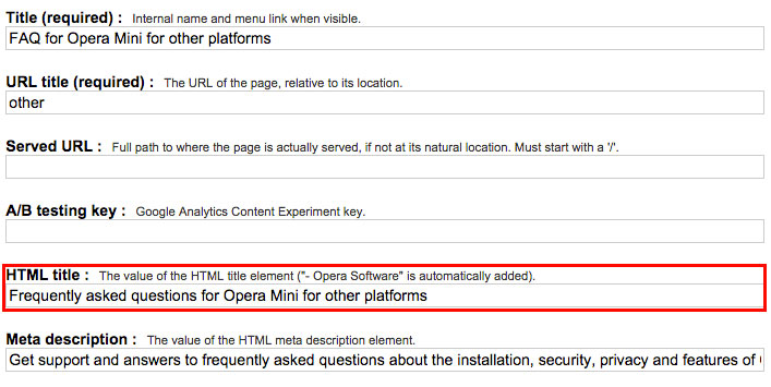
<head>
    <title>How to charge your COLDCAM</title>
</head>
Descriptive titles help with search engine optimization, if your support pages are public.
Write from most generic description to most specific.
For example, the page above describes using the COLDCAM app, a subsection of overall COLDCAM help. An appropriate title could be:
<title>COLDCAM help - COLDCAM for iOS - Log into my account</title>Titles should reflect the first-level heading of the page and should be understandable without context. You may wish to add the top-level domain to aid with out of context organization (like bookmarking or other listing).
<title>coldcam.com - COLDCAM help - COLDCAM for iOS - Log into my account</title>The purpose of each link can be determined from the link text alone. Screen readers often navigate from link to link with the Tab button, skipping text in between.
Avoid JavaScript on links. If readers do not use a mouse, they may not be able to navigate.
Describe the purpose of the link in the link text itself. Describe the link's transactional value, or at least the outcome of following them. Prefer calls to action and don't be shy about the link length.
<a href="http://help/">Help</a>[Help](http://help/)<a href="http://help/">Get help using your COLDCAM.</a>[Get help using your COLDCAM.](http://help/)<a href="http://help/">Read the COLDCAM support pages and get help using your COLDCAM camera and app.</a>[Read the COLDCAM support pages and get help using your COLDCAM camera and app.](http://help/)If you link to a file, specify the file format and size.
<a href="newsletter.pdf">Download our December newsletter (3.5MB, PDF).</a>[Download our December newsletter (3.5MB, PDF).](newsletter.pdf)If you localize content and the link leads to a different target language, specify the human language of the target content.
<a href="http://changelog/">See what's changed in the latest COLDCAM release (in Norwegian).</a>[See what's changed in the latest COLDCAM release (in Norwegian)](http://changelog/)Where possible, separate links from running text. Make them their own block. If you include links in running text, insert them at the end of paragraphs, or at least the end of the sentence.
<p>COLDCAM will use your system's default language to set the app's language. For more information, <a href="http://supportPage/">visit the Apple Support pages</a>.</p>COLDCAM will use your system's default language to set the app's language. For more information, [visit the Apple support pages](http://supportPage/).The default human language of each Web page can be programmatically determined.
Use the lang attribute for the html element to help browsers or other user agents determine the human language of your content.
The language attribute helps:
Use ISO language code references to mark-up your pages.
<html lang="en-US"> <!--U.S. English-->
<html lang="nl"> <!--Dutch-->Make Web pages appear and operate in predictable ways.
Consistency helps screen readers or people who view pages with increased zoom, where they may not see all elements of the page at one time.
Consistent and predictable layouts and heirarchies of text help these users navigate pages quickly and easily.
Navigational mechanisms that are repeated on multiple Web pages within a set of Web pages occur in the same relative order each time they are repeated, unless a change is initiated by the user.
Keep your top-level navigation consistent across all pages.
If subnavigation is needed, it may be inserted within the original heirarchy, but consistency of the navigation allows the user to locate or skip the pages' means of moving between content.
Components that have the same functionality within a set of Web pages are identified consistently.
Repeated elements like search boxes or icons use the same terminology to refer to them.
For example, a question mark that navigates to more information uses the same image and alternative text consistently throughout the site.
Produce documents that comply with W3C and ISO standards to:
Valid HTML means:
There are a number of tools available for you to validate files after you've edited them.
Use the W3C markup validation service.
Some command line tools will allow you to validate files in batches.
Prefer text to convey information. Use visual or auditory information only to reinforce what's been discussed in the text.
If information must be conveyed with non-text elements, provide textual alternatives.
Be consistent in how information is structured and presented.
Use plain text to draft and structure your content. You are a writer. You are not a designer, a developer or a videographer.
Write in Markdown. Convert to HTML. Style with CSS. And, validate everything.
Plain text is clean and easy.
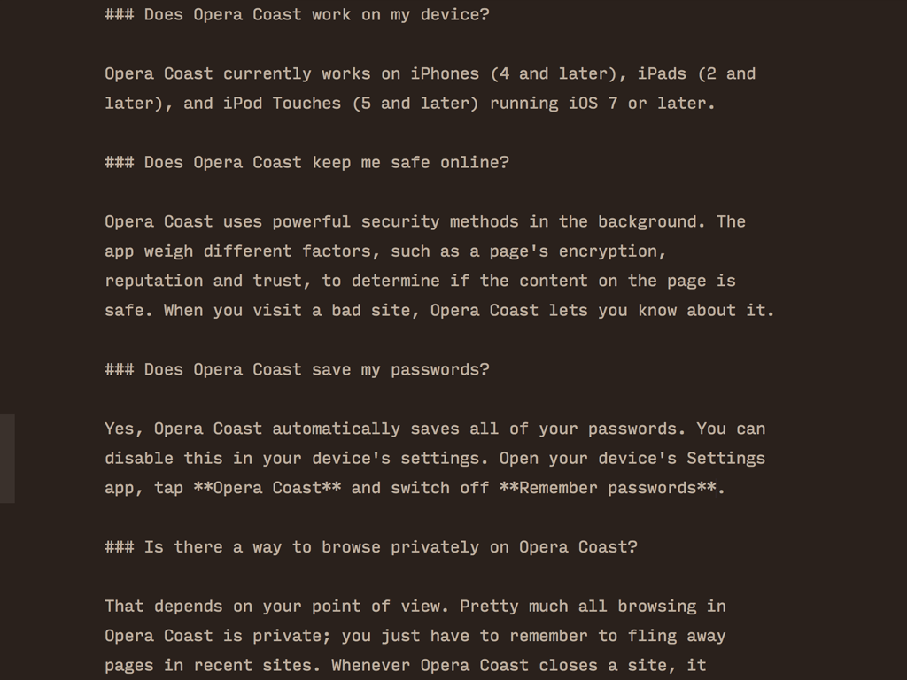
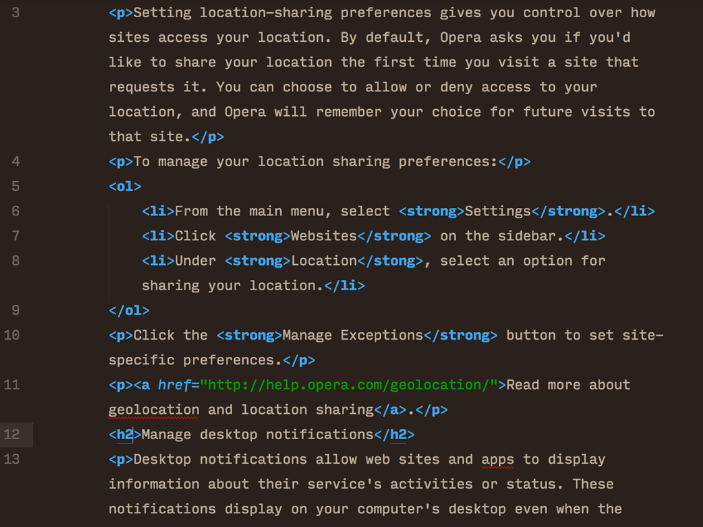
Rich text is distracting and difficult.
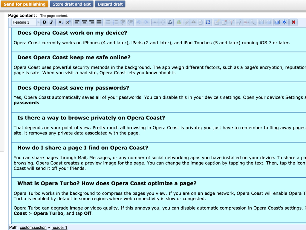
Markdown is clear and naturally facilitates writing.
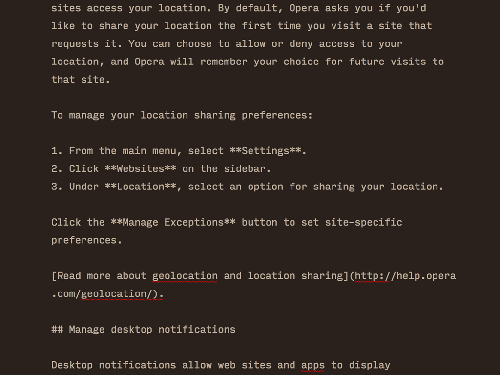
HTML can be confusing and introduces errors.
If you use a CMS, make sure your developer orients you to what each field does. Ask specifically about alternative texts, titles and other accessibility fields.
Use developer tools like Web Inspector, Firebug, or Chrome Developer Tools to remove style sheets and JavaScript. This helps you get a sense of how a screen reader might see a page.
Seriously, learn Markdown and use a Markdown converter to change plain text into HTML. This helps ensure page validation.
If you are familiar with @media rules in CSS, make your print stylesheet display alternative text for images and other non-text media. Then, print your page without images and read to see if all the information is clearly portrayed. The CSS looks like this:
img:after,
video:after,
audio:after,
object:after,
embed:after { content:attr(alt); }You can check your page's accessibility using AChecker online.
The W3C's Web Accessibility Initiative homepage contains strategies, guides, and resources for creating and maintaining accessible websites, and tons of great articles related to web accessibility.
W3C's Web Accessibility Evaluation Tools List includes a ton of tools to help you evaluate and identify web accessibility on your online properties.
Utah State University's Web Accessibility in Mind homepage has some great tutorials and training to help you learn more about web accessibilty and write more accessible web content.
The WCAG 2.0 recommendation in full is available from the W3C.
Gruber's original Markdown specification is available on the Daring Fireball website. There is currently no standard Markdown, but this is widely accepted as the preferred flavor.
Shoot me an email at samueli@opera.com
This presentation is available at getbettercopy.com/tekom/.


Your opinion is important to us! Please tell us what you thought of the lecture. We look forward to your feedback via smartphone or tablet at:
http://NORM18.honestly.deThe feedback tool will be available even after the conference.
HTML Slidy and related resources have been adapted from the W3C © 2005-2010 W3C ®(MIT, ERCIM, Keio). All rights reserved.