2018 samples
A framework for first impressions
Cloud products are shifting away from packaged releases to daily deployments. Atlassian encourages small, autonomous teams to deliver features and experience changes that address their target market's needs. Since everyone is proud of their work, these teams love to draw attention to what they're delivering, usually without thinking about the job their users are trying to accomplish or any other messaging they might experience in the process.

With this in mind, leaders from Atlassian's Jira Cloud platform (myself included) and our design system team came together to create a framework for introducing and announcing changes to our products. We took on more than just onboarding, and created design components and patterns to address the following triggers that represent change in software products:
- New product signup (typically referred to as "onboarding")
- New or updated features
- Removed features
- New or changed experiences
- New content changes (such as a new color scheme or navigation pattern)
- Feature discovery (also called an "inflection point")
Through intensive workshops, we explored and developed design approaches for each of these triggers. Working with prototypers, we tested our designs against emotional qualities and user comprehension. We iterated our designs and worked with our design systems engineers to build the most feasible, effective, and cheap implementation of our vision.
What we ended up with was a comprehensive framework all Atlassian designers can reference to build consistent and appropriate education experiences for announcing change in our products.
These best practice patterns were adopted by Jira Software, Jira Service Desk, Jira Core, Confluence, Stride, and Bitbucket. We regularly checked in with the success of each implementation and continued to iterate on our best practice guidance.
As much as I'd love to share the framework with you, it's proprietary to Atlassian. But, here's a small sample:
What to communicate
This is a user's first experience with a product, so write copy with beginners in mind. Explain where they are, the benefit of being here, and make the next step clear.
Users should understand that your product experience provides value and quickly caters to their needs. Point out the top 3 benefits for the user in context. Work with PMs to align messaging with product goals and behaviors associated with successful evaluations.
Build your first impression
A new product experience consists of 3 smaller flows:
- Use a focused task to understand the user's context and recommend a default that demonstrates the relevant product value.
- Use a focused task to have the user create a recommended top-level container, suited to their use case.
- Onboard the user to the top 3 product benefits in context.
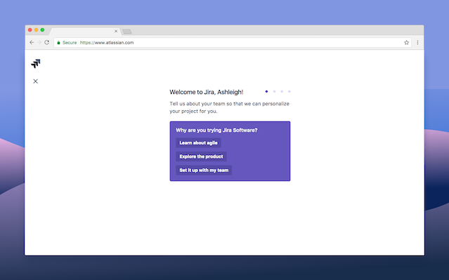
Understand the user's context
Use the onboarding questions pattern to collect information about the user and their context. Atlassian is the expert on teams and we provide recommendations on how to organize and structure teamwork. Be bold. Be smart. Research and develop a set of three questions that will get the majority of users to the right default fast.
This isn't the time to mine data. Avoid any questions that aren't relevant to the current use case and setup experience. The goal is to deliver people to their core need fast.
Create a recommended top-level container
Use the focused task pattern and the context you've collected to provide a recommended default container. Then, have the customer create their first container. This is the top-level object in your product. For example, in Jira family products, recommend a project type. In Confluence, recommend a space template. In Stride, recommend a room.
Onboard the user
When users land in their newly created container, use an onboarding tour to showcase the value of your product exactly where they land. Limit yourself to showing off the three most relevant user benefits. Show people what they can do next. If you can, leverage the information you collected previously to personalize and finetune the onboarding experience.
Always focus on the core value proposition of your product. Avoid the temptation to point out new features, or any features intended for power users. This is where smart, user-triggered notifications come into play.
Cure Brain Cancer Foundation
I had the great pleasure to work as a representative of the Atlassian Foundation with two other designers to help out the Cure Brain Cancer Foundation in 2018. Atlassian encouraged us to use our unique skills in a charitable project.

Cure Brain Cancer Foundation asked help from us to modernize their identity. Over a few months, we held workshops and interviews with Cure Brain Cancer Foundation board members and communication staff to uncover the values and image they saw in themselves.

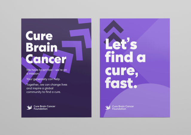
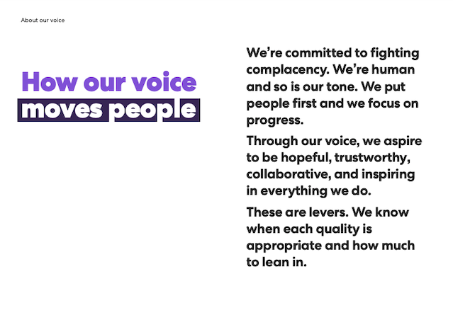
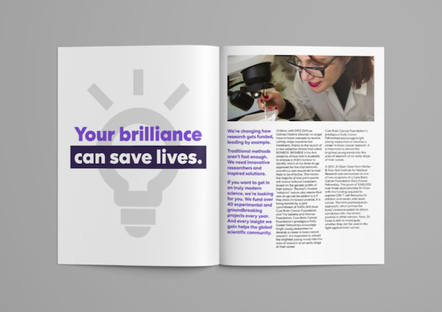
We delivered a new visual direction for the company that felt honest, uplifting, and true to their donors, researchers, and lobbyists. The look book included design and copy guidance, with examples of how to employ both in different contexts to different audiences.

It's a rare thing to feel so fulfilled applying my writing expertise. And, the heartfelt thanks from the Cure Brain Cancer Foundation board made it worth sweating the details.